Web Development Services are now essential for businesses seeking to establish a strong online presence in the current digital environment. Responsive web design is a crucial component of contemporary web development.
With the increasing number of devices used to access the internet, it is essential to develop websites that seamlessly adapt to various screen sizes and resolutions.
Hiring a web developer skilled in responsive design is crucial in this case. This article will examine the importance of responsive web design in modern web development services.
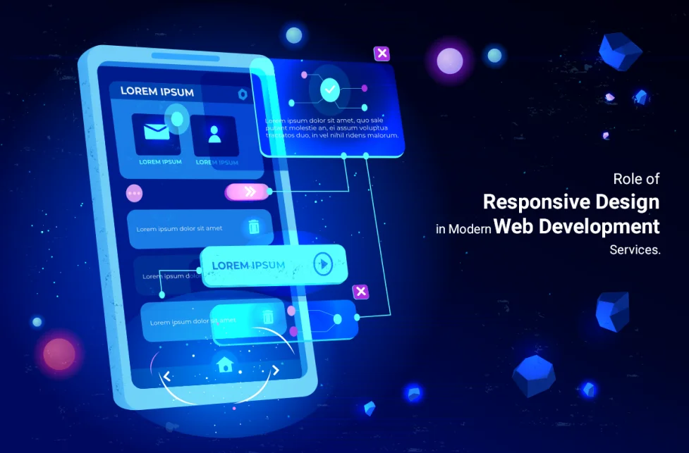
Understanding Responsive Web Design
Responsive web design refers to an approach that ensures a website’s layout and content adapt seamlessly to various screen sizes and devices, providing an optimal viewing experience for users.
It’s the practice of making websites that automatically scale their content (including text, graphics, and menus) to match multiple display sizes. The objective is to design an intuitive user interface that looks the same on all devices.
| Also Read: What is the Best Way to Pick a Reputable Website Design Company? |
Principles and Characteristics of Responsive Design:
Fluid Grids: Fluid grids are used in responsive design to make website elements scale proportionally to the screen size. This safeguards the content’s integrity and readability across all devices.
Flexible Images: Images on a responsive website are fluid, meaning they scale dynamically to fit various screen sizes without seeming blurry or losing quality. Maximum width attributes and other CSS methods, such as media queries, make this possible.
Media queries: Media queries are a set of CSS rules that let designers tailor the look and feel of a website to a user’s device by considering factors like screen size, resolution, and orientation. Websites can modify their looks and behaviours for various devices by utilising media queries.
Breakpoints: When a user’s browser window reaches a certain width, the website’s layout adapts to fit the user’s device better. By establishing breakpoints, designers can construct ideal layouts for various devices and guarantee a consistent user experience across all screen sizes.
Content Prioritization: Responsive layouts highlight the most crucial information, even on mobile devices. Maintaining a clean and focused interface while offering access to all relevant information requires clever placement and hiding of features.
Benefits of Responsive Design for Businesses and Users:
Improved User Experience: By making websites accessible and simple to navigate across a wide range of devices, the responsive design improves the user experience. To engage with the content, the user does not need to zoom, scroll, or pan horizontally.
Increased Reach and Engagement: More people can see and interact with your content because of responsive design’s ability to adapt to different screen sizes. Businesses may enhance conversions and customer satisfaction by providing a unified, high-quality experience across all devices.
Cost and Time Efficiency: A responsive website saves money and time by avoiding the need for multiple designs and builds for various screen sizes.
With a responsive design, you only need one set of files to support all possible viewing environments. This reduces expenses and time spent developing, making it easier to maintain and upgrade.
Search Engine Optimization (SEO): Responsive site design is crucial for SEO (search engine optimisation). Websites optimised for mobile use receive higher ranks from search engines like Google.
Better rankings in search engines, more organic visits, and more successful conversions are all possible results of a responsive design.
Future-Proof Solution: Responsive design’s flexibility and adaptability make it a future-proof solution, as new devices and screen sizes are always being introduced. Organisations should use website responsive design concepts to prepare for future gadgets and technologies.
| Also Read: 7 Tips for Creating Mobile-Friendly Websites |
The Role of Responsive Design in Web Development Services
Responsive design has revolutionised the field of web development, playing a vital role in creating websites that offer an optimal user experience across multiple devices and screen sizes.
With the proliferation of smartphones and tablets, responsive web design has become a crucial component of modern web development. Businesses may use these tools to expand their customer base, boost user engagement, and compete in the modern digital marketplace.
Mobile-First Approach: One mobile-first strategy acknowledges that mobile devices are now the primary way a huge percentage of people worldwide access the internet. Responsive web design prioritises mobile users by making sites accessible and enjoyable across all mobile devices.
Businesses may take advantage of the rising mobile browsing and shopping trend by prioritising mobile usability and efficiently reaching and engaging their mobile audience.
Fluid and Flexible Layouts: Create fluid and flexible layouts that adjust to various screen sizes and orientations; this is at the heart of responsive design. Responsive websites replace fixed-width items with percentages and ems.
This means that the material may adapt to the size of the display and fill it for the best possible viewing experience. The design automatically adjusts to the viewing device, so there’s no need to pinch and zoom whether you’re using a desktop computer, laptop, tablet, or smartphone to browse the site.
Media Queries for Device Detection: Third, use media queries to determine the user’s device. Media queries are essential to responsive layouts. They allow webpages to recognise the user’s device or viewport and adapt to its specific features.
Developers can use media queries to target specific CSS styles based on the viewer’s device, display settings, and more. This method allows web designers to make their sites work properly across various devices, giving each visitor the best possible experience.
Improved User Experience: User experience (UX) is paramount in web development. Websites built with responsive design are more likely to be usable, easy to navigate, and aesthetically pleasing on various devices.
The days of clumsy interfaces, unreadable text, and unresponsive buttons are over. Instead, consumers can use the site’s responsive design, simple menus, and obvious content hierarchy. Users are likelier to stick with your site, you’ll get more conversions, and your customers will be happier overall if the UX is good.
Search Engine Optimization (SEO) Benefits: To provide a more satisfying experience for mobile users, search engines prefer mobile-friendly websites in their search results. Websites built with responsive design automatically conform to the standards set by search engine algorithms and display properly across all mobile devices.
By eliminating duplicate content concerns and centralising ranking signals, responsive websites boost SEO performance. They use a single URL and uniform HTML across all devices. In addition, search engine results are improved by responsive design since it leads to better site performance, faster page loads, and fewer bounce rates.
| Also Read: Role of UX Design in the Improvement of Website Conversion Rate |
How to Implement Responsive Web Design in Web Development Services
Implementing responsive web design is a crucial aspect of modern web development services. It involves creating websites that adapt seamlessly to various screen sizes and devices, providing an optimal user experience.
Planning and Research:
Understanding the target audience and their device preferences: Having a firm grasp on who your audience is and what devices they prefer is step number one in effectively reaching them.
Determine the most popular devices and screen sizes used to access your website by analysing user demographics, device usage statistics, and user behaviour. Using this data as a starting point, designers and developers can create a site that effectively engages its intended demographic.
Analysing competitors and industry trends: Researching your rivals’ websites and monitoring market trends might illuminate what constitutes good, responsive design.
Research how other businesses in your industry have dealt with responsive web design to learn what worked and what didn’t. If you want your website to remain competitive, keep up with the newest industry trends and developing technology.
Design and Development Process:
Using fluid grids, flexible images, and media queries: First, by incorporating moveable grids and images, as well as media queries: To make layouts that can adjust to different screen sizes, responsive designs use fluid grids, flexible images, and media queries.
Designers use CSS frameworks like Bootstrap and Foundation because they provide pre-made responsive grid systems. These frameworks allow for the development of fluid grids, which modify their structure and component sizes in response to the user’s device’s display resolution.
Images that are “flexible” will scale appropriately and retain quality on various screens. Developers can modify the look and feel of a website for different devices by using media queries in the CSS.
Implementing responsive frameworks and tools: Using available, responsive frameworks and technologies can also help streamline the process of putting responsive web design into practice.
Pre-made responsive components and grids can be found in these frameworks like Bootstrap and then modified to meet the specific needs of your website.
Adobe XD and Sketch are two responsive design tools that help designers make prototypes that adapt to any screen size and test them on various devices.
Testing and Optimization:
Cross-browser and cross-device testing: The first step in ensuring your website looks and functions the same across all browsers and devices is to test it on as many as possible.
Ensuring the website works across various platforms and browsers, from desktop computers to laptops to tablets and smartphones, is important.
Ensure the user experience is consistent across all platforms by checking for layout problems, broken elements, and inconsistent behaviour.
Performance optimisation for different screen sizes: Second, ensure the site loads quickly on all platforms by optimising its performance for all screen widths. Caching systems, image optimisation, and minifying and compressing CSS and JavaScript files are all methods for improving performance.
Mobile devices require extra care because their internet connections are typically slower. Performance optimisation is essential to provide a smooth user experience and reduce bounce rates.
| Also Read: Top 5 Web Design Trends to Watch |
Hiring a Web Developer for Responsive Web Design
When implementing responsive web design, hiring a skilled web developer is crucial. A web developer with expertise in responsive design can ensure that your website provides an optimal user experience across different devices.
Skills and Expertise to Look for:
Proficiency in HTML, CSS, and JavaScript: Web developers need to be well-versed in HTML, CSS, and JavaScript, as they are the foundational technologies for creating mobile-friendly sites.
They can make fluid designs, use responsive design concepts, and add interactive elements and animations using their command of these languages.
Experience with responsive frameworks and design principles: Look for a web developer who has familiarity with responsive frameworks like Bootstrap or Foundation, as well as experience with the principles of responsive design.
These frameworks facilitate responsive design with their prefabricated grids and components. To further guarantee the site’s proper adaptation to various screen sizes, the developer should have a firm grasp of responsive design elements, including fluid grids, flexible pictures, and media queries.
Portfolio Evaluation:
Reviewing past projects for responsive design examples: Check the site designer’s previous work to understand how well they apply responsive design.
Investigate their portfolio for samples of responsive websites they’ve created. Check how the designs and components adapt to different screens to guarantee a consistent user experience.
Assessing user experience and visual appeal: Responsive web design extends beyond just technical execution, taking into account both usability and aesthetics. Check the developer’s previous work and judge it based on its usability and aesthetics.
Consider making the site easy to navigate, making the text legible across various screen sizes, and maintaining a unified aesthetic. Your responsive website will fare better if built by someone who gives equal weight to form and function.
| Also Read: Responsive Web Design and how it affects user experience? |
Communication and Collaboration:
Clear communication channels with the developer: Open lines of communication with the developer are crucial when working with a web developer on a project requiring responsive design.
Ensure you and the developer can easily communicate via email, messaging apps, or other project management software. This facilitates timely updates, a better understanding of expectations, and the resolution of any problems that may arise.
Collaboration for effective, responsive design implementation: To successfully execute a responsive design, the web developer must work closely with other project stakeholders, including designers and content creators.
The success of implementing responsive design principles depends on a developer’s willingness to collaborate and actively seek advice from other team members.
Try to find a developer willing to take criticism to heart, has ideas to offer based on their experience, and can get along with others.
| Also Read: Top 20 Web Development Companies in Hyderabad |
Extended Web AppTech: Unleashing Innovative and Tailored Software Solutions
Extended Web AppTech is an industry-leading provider of customised software solutions. They specialise in developing and enhancing software applications to satisfy each client’s needs, using a team of experts. Their ability to combine technical expertise with creative thinking, resulting in exceptional solutions for their clients, sets them apart.
Extended Web AppTech is proud to be at the forefront of technological advancements as a business. To provide cutting-edge services to their clients, they continually monitor the digital and web-based solutions landscape for new developments. This dedication to innovation and acceptance of new ideas has positioned them as a leader in their industry.
| Also Read: Hire Expert Web Developers For Innovative And Reliable Solutions |