Introduction
Web design plays a key part in the user experience of a website or application. It influences how easily visitors can access the information they need, move through the site, and complete their desired actions. In recent years, there has been a shift towards developing websites that are responsive, meaning they can adjust and work properly on a range of different devices and screen sizes. This is known as Responsive Web Design (RWD).
Responsive Web Design is a design strategy that ensures that a website or application’s appearance and content are optimised for viewing on any device, regardless of screen size or quality. This is achieved by using flexible grid layouts, pictures, and CSS media queries, which allow the website to change and rearrange its content and elements to fit the screen size of the device it is being viewed on. The objective of RWD is to deliver an optimal viewing and interaction experience for the user, making it easy for them to access and use the site, no matter their device.
The user experience of a website or program is the overall feeling a user receives when interacting with it. It covers characteristics such as usability, accessibility, and aesthetics and plays a vital influence in determining whether a user will return to the site or promote it to others. Good web design is vital for establishing a pleasant user experience. It may make a website or application easier to use, more visually appealing, and more entertaining for the user.
A website or application with bad web design can be frustrating and may encourage visitors to quit and explore alternate solutions. As a result, it is crucial for web designers to consider the user experience when developing a website or application and to employ methodologies such as Responsive Web Design to ensure that the site is suited for a wide range of devices and users.
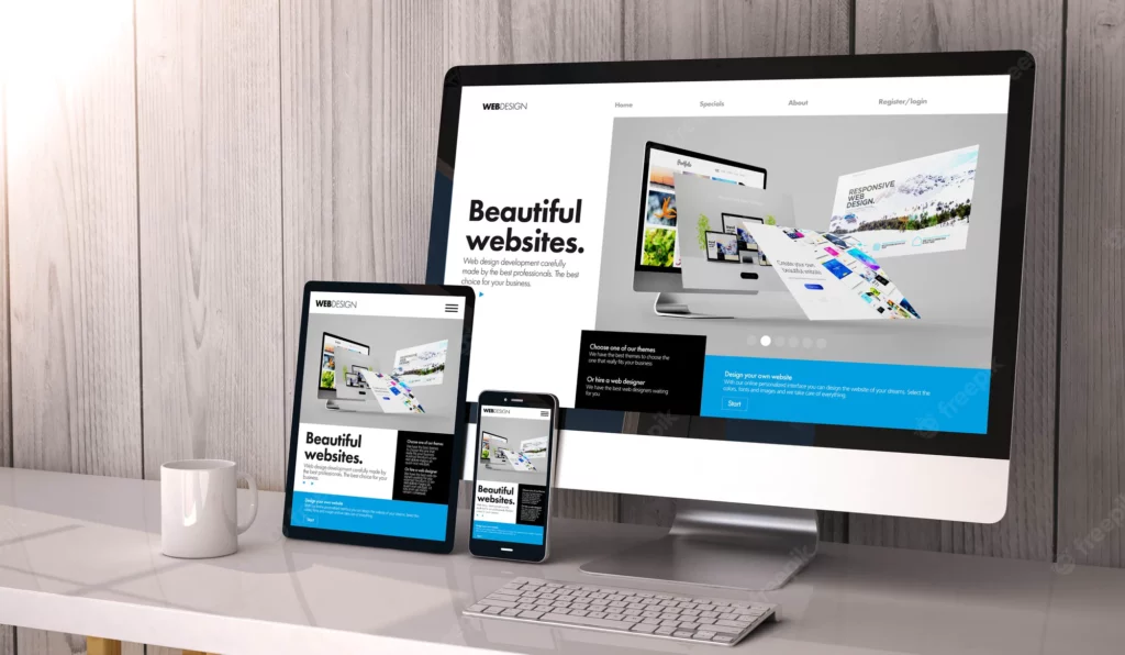
How Responsive Web Design Affects User Experience?
Responsive web design is creating websites and applications that respond to the viewing environment by resizing their components to match the available width, height, and orientation of the display. A responsive website will look good and function properly regardless of the device used to access it.
Accessibility boosted across platforms
Websites with responsive layouts are easier to navigate on various devices. In the past, while designing websites for different devices, each one needed a unique layout and set of features. This is inconvenient for businesses and customers who may suffer a jarring shift in their service quality when they move between devices. Responsive web design eliminates this issue by giving users a uniform experience across all devices by automatically adjusting to each visitor’s screen size and orientation. Because of this, the website is more accessible and user-friendly than ever before, regardless of the device used to access it.
Increased accessibility for all users
Increased accessibility is another major advantage of responsive web design. Users that rely on screen readers, voice recognition software, or braille displays will have no trouble navigating a responsive website. This is especially crucial for companies and institutions that must adhere to legislation regarding the needs of people with disabilities, such as the Americans with Disabilities Act (ADA). Furthermore, people with slower internet connections or older devices can still view and use the website thanks to responsive web design, as the site adapts to the user’s device and connection speed.
Enhanced user satisfaction and loyalty
One of the major advantages of flexible web design is an increase in user happiness and loyalty. A responsive website adapts to the visitor’s screen size and displays legible and useful information. Users who have a good time on a website are more inclined to return and share their pleasant experiences with others. Plus, search engines like Google appreciate responsive web design, which means more visitors and business.
In summary, responsive web design substantially impacts user experience, as it improves usability on multiple devices, expands accessibility for all users, and enhances user happiness and loyalty. Because of this, companies and groups must consider providing a high-quality and efficient online presence.
Benefits of Implementing Responsive Web Design
A responsive web design (RWD) method ensures that a website’s layout and content are optimised for reading on any device, irrespective of the screen size or resolution. RWD can alter the layout of a website to fit the size of the viewer’s device by using a combination of pictures, flexible grids, and CSS media queries.
Implementing RWD on your website can provide you with several benefits, including the following
1 : Google has said that responsive site design is their preferred strategy for mobile optimization, which should result in better search engine ranks. Websites that use responsive web design (RWD) are more likely to rank higher in the results provided by search engines because they offer a superior user experience for mobile users.
2 : Reduced expenses associated with website construction and upkeep: Responsive web design (RWD) enables you to have a single website that functions faultlessly across all devices, eliminating the need to develop multiple versions of a website to accommodate different types of devices. The creation and upkeep of your website can become less time-consuming and costly due to this.
3 :Expanding your reach and the number of potential customers can be accomplished by making sure that your website is accessible to users on all types of devices. Mobile devices are becoming increasingly widespread, and as a result, this is an increasingly important consideration. Because RWD allows websites to be easily accessed on various devices, including mobile phones, tablet computers, notebook computers, and desktop computers, it enables businesses to communicate with many potential customers.
4 : RWD guarantees that your website is easy to use and navigate, no matter the device used, contributing to an overall improvement in the user experience. This can result in higher levels of user engagement and happiness, which, in turn, can ultimately lead to higher levels of conversions and sales.
5 : RWD ensures that your website will continue to be optimised for viewing on these devices even as new devices with different screen sizes and resolutions are released. This is accomplished without the need for any additional development or maintenance on your part.
Implementing a responsive web design can have several positive effects on your website, including an improvement in its search engine rankings, a reduction in the costs of development and maintenance, an increase in reach and the number of potential customers, an improvement in the user experience, and future-proofing.
Best Practices for Responsive Web Design
The following are some recommendations for best practices in responsive web design:
1 : Planning and designing for multiple device sizes
Planning and designing for multiple device sizes It is important to take into consideration the various screen sizes that your website will be accessed on, including desktops, laptops, tablets, and smartphones. This is done by planning and designing for multiple device sizes. Creating a responsive design grid, a system that helps you ensure that your layout and content are properly aligned across different devices is one way to accomplish this. This system helps you ensure that your layout and content are properly aligned across different devices.
2 : Using responsive web design frameworks and tools:
Utilizing frameworks and tools for responsive web design many available frameworks can assist you in constructing a responsive website. Bootstrap, Foundation, and Materialize are popular choices in this category. These frameworks offer pre-designed templates and components that can be easily customized and incorporated into your website. As a result, you will save a lot of time and effort.
3 : Testing and optimizing the user experience on different devices
It is essential to test your website on various devices to ensure that it appears and functions correctly. User experience testing and optimization It is essential to test your website on various devices. This includes checking for issues such as broken links, layout flaws, and delayed loading times, among other things. You should also consider the user experience across various devices, such as how straightforward it is to navigate and engage with the website when seen on a smaller screen.
When developing a responsive website, here are some important considerations to keep in mind
- Employ a strategy known as “mobile-first design,” which entails beginning the design process with the smallest screen size device and then progressing to larger devices as you go. This helps to ensure that your website is optimised for mobile devices and that the design scales up appropriately when viewed on larger screens. Moreover, it also ensures that your website is accessible.
- Always keep the content hierarchy in mind, with the most vital information at the top of the page. This makes it easier for people to find what they’re looking for, which is especially helpful on more compact screens with restricted real estate.
- Use responsive images whose dimensions can be automatically adjusted to match the viewing area. This helps prevent problems such as graphics that are too large or too small for the screen, which can influence the user experience.
- Keep the number of pop-up windows and interstitials to a minimum because they can be especially obnoxious on mobile devices, which have a restricted amount of screen real estate.
- Use responsive typography, which entails selecting font sizes and legible line heights on various screen sizes.
Responsive web design refers to developing a website that, regardless of the device that consumers are viewing it on, offers the best viewing experience possible. If you adhere to these best practices, you can ensure that visitors of any device can access your website easily, that it is user-friendly, and that it has a visually appealing design.
Conclusion
When it comes down to it, Responsive Web Design (RWD) is an essential part of today’s web development because it vastly enhances the user experience across a wide range of devices. With RWD, websites can automatically adjust for the user’s device’s size, resolution, and orientation for a consistent and user-friendly experience across all devices. This is especially crucial in the modern era when people increasingly use various devices, from smartphones and tablets to laptops and desktops, to access the internet.
As a bonus, RWD improves a website’s usability by making sure its content and features are accessible and usable across a wide range of devices. This is crucial for companies who wish to attract a diverse customer base by making their website easy to use for everyone. If a company uses RWD, its website will be optimized for all devices, boosting client satisfaction and conversion rates.
Because RWD makes it simpler for search engines to crawl and index a website’s information, it can benefit a site’s organic search engine rankings. This cannot be overstated for companies relying on search engine organic traffic to generate revenue and new leads.
Conclusion
Responsive Web Design is a crucial part of today’s web development and should be incorporated into every website. A company’s customer happiness and conversion rates will rise if they implement RWD’s user experience improvements, increased website usability, and improved search engine results.