Responsive Web Design
Optimising your app for large screens
A web design strategy called responsive web design (RWD) aims to create web pages that display correctly across all screen sizes and resolutions while maintaining acceptable usability. It is how a multi-device web should be designed. We’ll explain various methods for mastering it in this article to assist you. The browser will automatically reflow the text to fit the viewport if you construct a web page using simple HTML and no CSS and resize the window. When a user narrows their browser window or visits the site on a mobile device, the site may appear squashed if the widescreen line length is lowered with CSS, for example by adding columns or a lot of padding. Our developers at Extended web app tech try their level best to solve your queries and create more beautiful websites!

The Best User Experience Through Design
Way to design for a multi-device web.
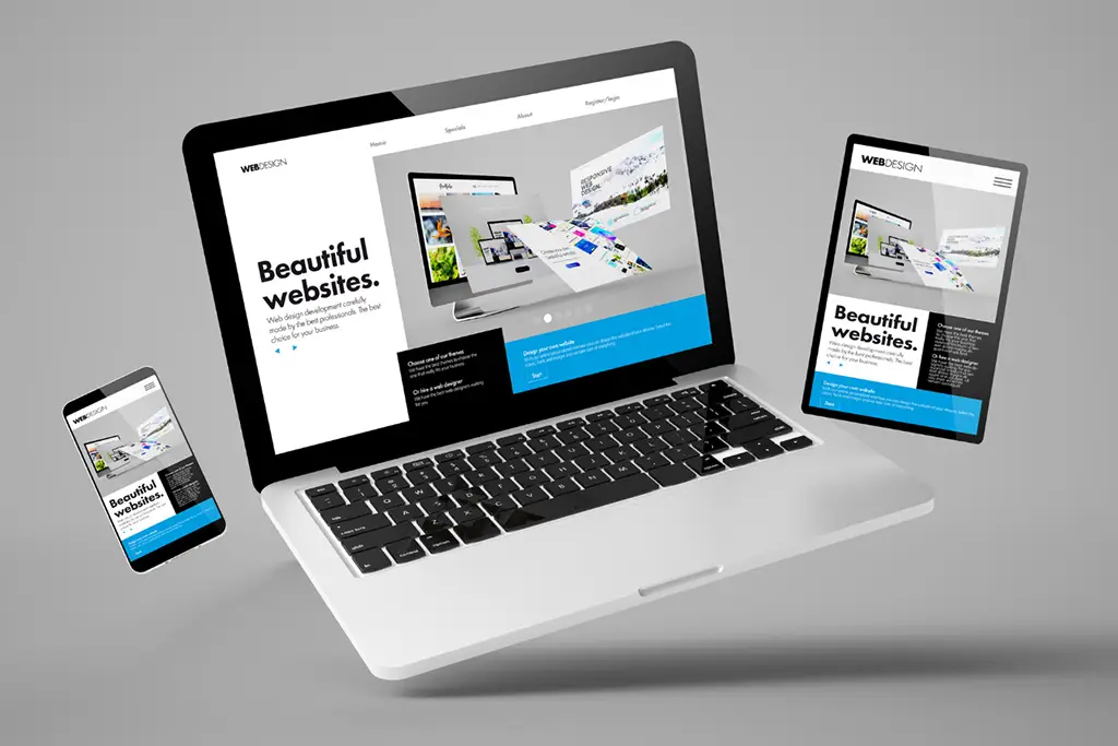
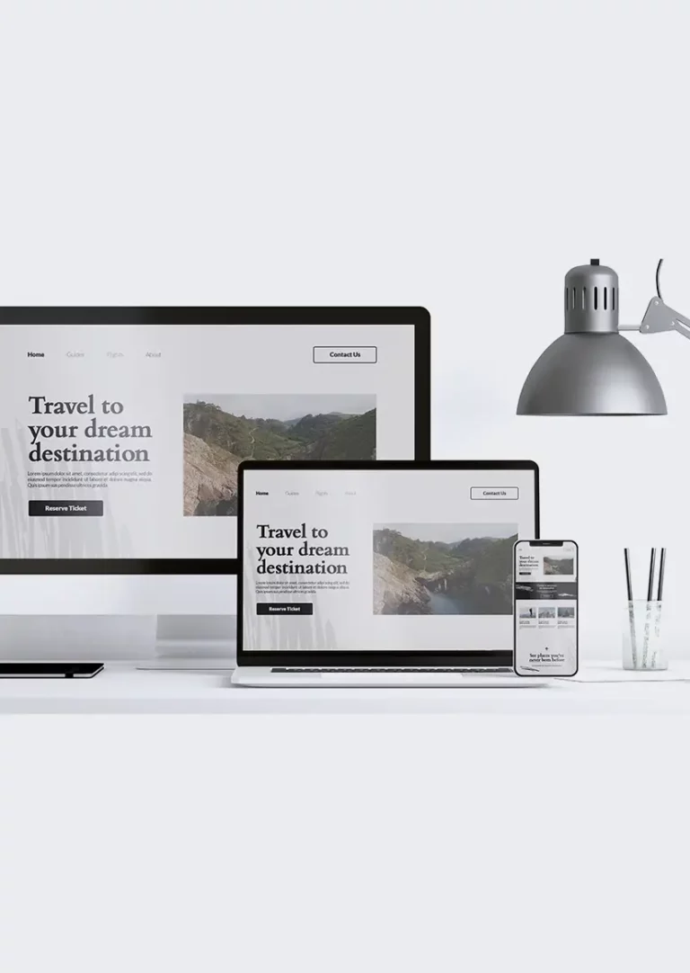
Desktops, tablets, and phones are just a few of the many devices that may be used to access websites. No matter the device, your website should be appealing to the eye and simple to navigate. Instead of leaving out material to accommodate smaller devices, web pages should adjust their content to fit any device. When you use CSS and HTML to resize, hide, shrink, enlarge, or relocate the content so that it looks nice on any screen, you are using responsive web design. Your website will appear good on all devices thanks to responsive web design. Simply HTML and CSS are used in responsive web design.
Software or JavaScript is not what responsive web design is.
Three Main Components of a responsive website design?
Responsive web design is divided into three main components: the media query, the web browser, and the responsive web interface itself.
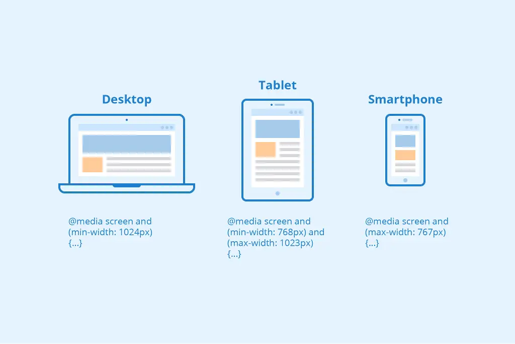
Media Queries
Media queries are supported by the latest web browsers and work by creating media queries. They are called “media queries” and can be used in various ways, such as in connection with the layout of a page or as part of the content of an application.
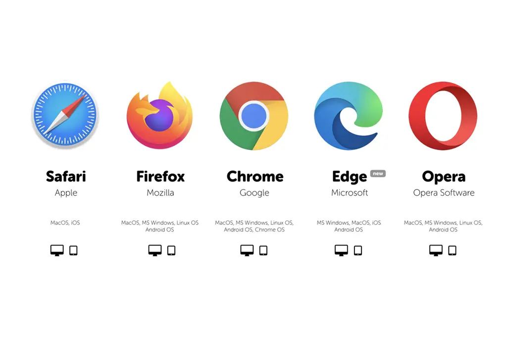
Web Browser
Websites often feature a lot of photos, thus it’s important to maintain the fluidity of those images as well. The idea behind liquid graphics is to communicate ideas at the largest size possible. When creating responsive websites, designers let the browsers resize the images rather than announcing their height and width in the code.
Website interface
In addition to images’ flexibility, native features like drop-down menus and keyboards should be used as efficiently as possible to give users a wonderful experience, whether they are using mobile or desktop.
Why Responsive Web Design Important?
The rise of responsive design has to do much with the rise of mobile devices, tablets, and smart devices like Kindle, game consoles, etc. The modern-day user expects to be able to access any website with a vast range of devices. Your website should be ready to handle any scenario. You cannot ignore these demands because numbers do not lie: according to recent studies,


more than 80% of users surf the internet using mobile devices in 2019;
more than 60% of Google’s visits are done via a mobile device;
- Websites that look good on smartphones and other mobile devices are given preference by Google.
- Consistent user experiences on all platforms increase engagement, lead generation, sales, and conversion rates.
- You can miss out on new leads and sales from the mobile web if your website isn't well-designed to be responsive.
- Your target audience may be reached and your messages can be delivered on all different types of devices (tablets, phablets, smartphones).
- Prospects stay on your website longer since it offers a consistent user experience and immediately benefits them.
- It is economical. Instead of building different versions of the same website to accommodate various screen sizes, responsive design is more affordable.
Choose Our Developers
Responsive and custom design means website performance is improved with a responsive and custom design. Our developers don’t let the content load entirely at once because unnecessary pieces have been removed and animations have been turned on and loaded in. As a result, loading times for web pages are reduced, which speeds up website display. So definitely choose us!