Minimalism vs. Maximalism in Web Design: What's the Difference?
Two of the most popular web design trends—Minimalism and Maximalism—involve polar opposite methods. It can be challenging for designers to choose between emphasizing strong, attention-grabbing visual features and avoiding pointless clutter. When you compare the key distinctions between Minimalism and Maximalism, you can quickly decide which style will appeal to prospective guests more.
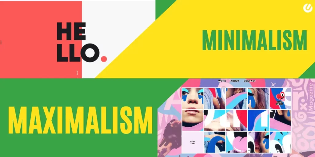
As a general rule, Minimalism in web design promotes using straight lines, clean typefaces, and flat backdrops to maximize impact with the fewest possible elements. In sharp contrast, Maximalism emphasizes wealth through vivid colors, expressive typefaces, and loud backdrops.
We’ll discuss both Minimalism and Maximalism in web design in this article. Then, we’ll review their primary differences and why you might choose to use them. Let’s get going!
Minimalism
Many designers have felt the urge to reduce visual design to its most basic components in reaction to a world becoming increasingly congested. The idea behind a minimalist design is to keep things simple and use what’s necessary to get the job done.
Minimalism: What Is It?
A style known as Minimalism emphasizes simplicity. In essence, it distills web design down to its essential components.
Eliminating unused and distracting components is the aim of minimalist web design. White space, simple graphic interfaces, and more subdued color schemes are frequently used on minimalist websites. Visitors will feel less overwhelmed as a result of this:
Less is more when creating with simplicity in mind. Even though you’re not required to use a boring black-and-white background, minimalist websites tend to draw attention away from the design. They are quiet and inviting to many consumers instead of being flashy and gratuitous.
In praise of Minimalism:
- Modern
- Simplistic
- Sophisticated
What the critics claim:
- Basic
- Boring
- Uncreative
Maximalism
Maximalism’s motto is “go big or go home,” in contrast to Minimalism’s “less is more.” Maximalism is about making enormous, dramatic images that overwhelm, oversaturate, and overstimulate the senses, and it encompasses several contemporary contentious design movements like Anti-Design, Brutalism, and organized chaos.
According to Camilla, “‘less is more’ isn’t always true in design; it depends on what will resonate with your audience the most.” A maximalist design can draw and hold viewers’ attention and help you stand out from rivals if you’re trying to disrupt the market or create a young, rebellious audience.
Maximalism: What Is It?
Maximalism is the complete opposite of Minimalism. Using striking colors, typefaces, and User Interface (UI) components, this design approach immediately captures a visitor’s attention.
A maximalist website grabs the viewer’s attention, whereas a minimalist website detracts from its design. By combining a dazzling (and occasionally extravagant) variety of styles, materials, and color schemes, Maximalism adds a “wow” factor:
The ultimate objective is to create a unique website. Although practicality should still be a priority in maximalist designs, they can also set a site apart from rivals. Maximalism is unique, quirky, and entertaining rather than more subdued and alluring.
In praise of Maximalism:
- Eye-catching
- Unique
- Bold
What the critics claim:
- Chaotic
- Ugly
- Obnoxious
Minimalism vs. Maximalism: 4 Significant Differences
The minimalist vs. maximalist argument has entered new realms because of web design. Examples of both aesthetics that are equally powerful push the limits of what it means to approach design in a minimalistic or all-out manner.
Maximalist websites are becoming more common because they can keep visitors’ attention for an additional (critical) few seconds when they are otherwise disengaged. Typical elements of maximalist web design include variable typefaces, animation, neon colors, and Memphis patterns.
Other designers see the responsive sites’ generous space allocation as an opportunity to build something more calming and pleasant.
On large screens, minimalist patterns appear sweeping and beautiful. Additionally, they are typically easier to operate and read on smaller ones. There is a claim that site designs with minimal styling encourage more time spent exploring. This may be why many blogs, news sites, and other text-heavy websites use minimal design elements like white space, neutral colors, and clean typography to entice visitors to stay longer.
Now that you are familiar with the fundamental differences between maximalist and minimalist web design let’s take a closer look. You may choose how to create the websites for your clients more readily after knowing the key distinctions between the two types.
1 : Color Palette
You’ll notice a harmonious and impartial color scheme in Minimalism. These websites have soothing color schemes with complementary tones:
Bright colors can be used in minimalist websites, but only sometimes. Typically, this will only draw attention to the most crucial components, including call-to-action buttons.
On the other hand, a maximalist website’s bright color scheme will likely catch your eye immediately. Bright and unusual color combinations are frequently used in this design aesthetic to catch the eye right away:
Maximalism occasionally pushes the limits of “good” design principles with its bold, clashing colors. Maximalists want to create unique websites, contrary to the suggestions of certain designers who wish to appeal to a broad audience. This leads to experimental designs that some people find unappealing.
Consider your audience when choosing between these two design fads. Consider using a minimalist color scheme if you want to draw in a wide range of users. On the other extreme, Maximalism can be instantly recognizable, which can raise brand awareness.
2 : Using Space
Additionally, the utilization of white space is a hallmark of minimalist websites. This open space serves as a natural division for the many design elements:
Frequently, white space can highlight the important content on your website. It might make it easier for users to browse your content without feeling overwhelmed by a lot of text or visuals.
Maximalism has the potential for organized chaos. You’ll notice a blend of various bold visual components in place of space:
So be sure to evaluate your website’s navigation, readability, and usability while you create a maximalist design. You’ll discover where to draw the line regarding Maximalism as you gain experience.
Feel free to go all out with features in some areas of your website. To increase usability, you can add extra white space as users scroll or go to another page.
3 : The Number of User Interface (UI) Components
Unimportant parts may be eliminated or hidden by some designers. To save space, minimalist websites, for instance, might hide the navigation menu. Additionally, this may result in a cleaner home page:
On the other end, maximalist designs occasionally have many UI components. A website can become congested and difficult to use by combining many typefaces, graphics, videos, and other features:
Your goal as a designer is to produce an engaging website that users will remember. A maximalist strategy will contain eye-catching visuals, but avoiding alienating users with impenetrable user interfaces is crucial.
Even though simplicity can be more soothing to the eye, it incorporates all the essential components. Visitors looking for a single piece of information won’t want to trawl through the entire website. It’s better to keep your interface straightforward and functional.
4 : Typography
Websites with a minimalist design will use easier-to-read typefaces. There won’t be many distracting aspects, notwithstanding the possibility that some headings may be larger and bolder than others:
In contrast, Maximalism, which aims to draw attention, may use flamboyant, recognizable typefaces. This can convey the feel and branding of the website right away:
Additionally, various fonts, sizes, and colors may be used on the same page. About maximalist designs, there are no creative limitations.
Both strategies have benefits and drawbacks, so careful planning is necessary. Even though the maximalist design might be distinctive, using obscure fonts may make your material difficult to comprehend. Although these can be boring, you’ll have safer font alternatives with Minimalism.
Which web design trend, Minimalism or Maximalism, is preferable?
Here are the primary distinctions between maximalist and minimalist web design for review:
Color Palette: While Minimalism emphasizes complementary colors that appeal to most people, maximalist designs may incorporate strong, clashing hues.
Using the Space: More negative space is used on minimalist websites to draw attention to only the most crucial components. With Maximalism, there is frequently less white space and more “ordered chaos.”
The Number of User Interface (UI) Components: While Maximalism places a variety of features on a single page, Minimalism prioritizes easy navigation.
Typography: A mix of typefaces in various sizes, styles, and weights can be used in maximalist designs, but minimalist websites must stick to only one font.
You might not know the ideal style to choose while creating a website. Before beginning, evaluating both Minimalism and Maximalism is best because each approach can have advantages and disadvantages.
Your website can maintain a minimalist aesthetic by being uncomplicated and uncomplicated. This can expedite the design process and save time. Additionally, it guarantees that every visitor can enjoy their browsing experience.
For corporations or websites for colleges, Minimalism can work well. You must maintain the design simple and easy to navigate because these sites receive a lot of traffic from different users.
But there isn’t much room for imagination. To demonstrate your abilities as an artist or graphic designer, you should experiment with various colors, typefaces, and textures. A maximalist strategy may appeal to outspoken individuals and distinctive brands.
Designing towards Maximalism makes it simple to include too many visually obtrusive features. Avoid employing ominous pictures and colors, even though they may fit your unique style. The bounce rate of your website could substantially rise if you go overboard.
Conclusion
The wrong style decisions might have a negative effect on brand awareness, readability, and navigation of your website. While Minimalism can eliminate clutter and maximize negative space, Maximalism can provide creative freedom and distinctive brand imagery. Consider what will work best for your audience when choosing between the two options.